Contact Card with Blurred Background using Canvas
, on JavaScript
Many times on the web pages we come across displaying some type of card, that displays some information with cool looking background. These may be contact cards or displaying the information for some place like on any travel site. One example is below:
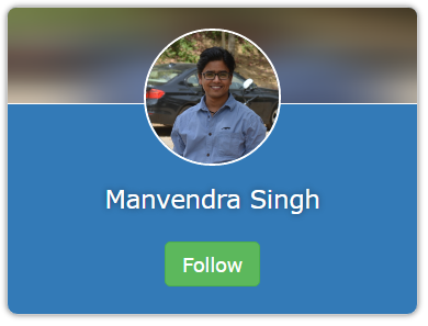
You might have noticed the background of the header of the card. It’s the same image background as we have on the card’s center, but blurred!
Let’s see how we have achieved this effect. Following is the markup for the card and the CSS.
<div class="card">
	<canvas id="header-bg" class="header-bg"></canvas>
	<div class="avatar">
		<img src="me.jpg" crossorigin ref="image" />
	</div>
	<div class="content">
		<p class="name">Manvendra Singh</p>
		<p>
			<a target="_blank" href="https://twitter.com/Manvendra_SK" class="button">Follow</a>
		</p>
	</div>
</div>
* {
	box-sizing: border-box;
	font-family: Verdana;
}

.card {
	min-width: 300px;
	max-width: 300px;
	position: relative;
	border: 1px solid #ccc;
	border-radius: 8px;
	text-align: center;
	padding: 0;
	background-color: #337ab7;
	color: rgb(136,172,217);
	margin-bottom: 32px;
	box-shadow: 0 0 5px rgba(0,0,0,.5);
}

.card .header-bg {
	position: absolute;
	top: 0;
	left: 0;
	width: 100%;
	height: 70px;
	border-bottom: 1px #fff solid;
	border-radius: 6px 6px 0 0;
}

.card .avatar {
	position: relative;
	margin-top: 15px;
	z-index: 100;
}

.card .avatar img {
	width: 100px;
	height: 100px;
	border-radius: 50%;
	border: 2px #fff solid;
}

.card .content {
	margin-top: 10px;
}

.card .content .name {
	color: white;
	text-shadow: 0 0 6px rgba(0,0,0,.5);
	font-size: 18px;
}

p {
	margin: 0 0 20px;
}

/* Taken from Bootstrap 3 */
.button {
	display: inline-block;
	padding: 6px 12px;
	margin-bottom: 0;
	font-size: 14px;
	line-height: 1.42;
	text-align: center;
	white-space: nowrap;
	vertical-align: middle;
	cursor: pointer;
	user-select: none;
	background-image: none;
	border: 1px solid transparent;
	border-radius: 4px;
	color: #fff;
	background-color: #5cb85c;
	border-color: #4cae4c;
	text-decoration: none;
}

.button:hover {
	color: #fff;
	background-color: #449d44;
	border-color: #398439;
}
/* Taken from Bootstrap 3 */
This is standard HTML and CSS, but with one difference, if you have noticed the canvas element <canvas id="header-bg" class="header-bg" ></canvas>. This is where the magic is happening. Our goal here is to draw an image (a blurred image, to be precise) on the canvas.
As I said we are drawing an image, so, it’s not a background image, but a foreground image, in reality, that is just painted on the
canvaselement.
In the following JavaScript code we are obtaining a 2d context for the drawing from the canvas element and drawing a new image on the canvas using canvas.drawImage() method. This would paint the normal image on the canvas. To blur the image we are using Mario Klingemann’s library1 that blurs the pixels of the canvas on line number 14.
We are using stackBlurCanvasRGBA function from the library that takes 5 parameters, canvas id, top x, top y, width, height and the radius. radius defines how blurry the image would be, we are using 50.
var canvas = document.getElementById('header-bg');
var context = canvas.getContext('2d');

var background = new Image();
background.src = 'me.jpg';

var drawBlur = function() {
	var w = canvas.width;
	var h = canvas.height;
	context.drawImage(background, 0, 0, w, h);

	// This line is creating the real magic.
	// Comment it to see what is the default behavior.
	stackBlurCanvasRGBA('header-bg', 0, 0, w, h, 50);
}
background.onload = _ => drawBlur();
So, folks, this is how we accomplish blurred images in HTML5.
Thanks for reading till here. See you next time.